Fixed Attachment CSS Gradients

Yeah it’s been a while since I last posted. I need to start posting more small things instead of convincing myself that only really big cool things are blog worthy. So, here’s something small.

I was recently admiring the gradient backgrounds on messages in Facebook messenger. Specifically, I liked how the gradient colors stayed relative to your viewport even as you scrolled. I thought it would be fun to attempt to replicate this in CSS.

The way I implemented this was simply to use the desired gradient as a background-image on the element, which allows us to use the powerful css properties that are available for background images. There are quite a few interesting ones that can be used for cool things, like background-position and background-clip, which I may explore some other time. The only property we need to use in this case is background-attachment: fixed; on the message elements. This works much like fixed in other contexts in CSS.

From MDN on background-attachment:

fixed: The background is fixed relative to the viewport. Even if an element has a scrolling mechanism, the background doesn’t move with the element.

Try scrolling on the messages to see the effect in action. Also try switching the color scheme for some more dramatic gradients.

See the Pen Messenger background gradients by Skylar Brown (@skylarmb) on CodePen.

Shoutout to some cool and fun tools I used:

Emojify: https://matthewmiller.dev/experiments/emojify/

Corporate Ipsum: https://www.cipsum.com

uiGradients: https://uigradients.com/

...
Read more...

A Simple Input Toggle

A simple, animated, and functional all-CSS toggle switch I made for Headnote. It is based on a checkbox input and there is no Javascript required, so you can easily put it right into any existing application where you use checkboxes.


See the Pen CSS Toggle by Skylar Brown (@skylarmb) on CodePen.

...
Read more...

Loading Spinners

Inspired by /r/LoadingIcon, I made these two CSS loading icons.


See the Pen squares3 by Skylar Brown (@skylarmb) on CodePen.

See the Pen squares2 by Skylar Brown (@skylarmb) on CodePen.

...
Read more...

A Break From the Norm

I usually post about code, but today I want to post about tooling and process. There are a few things that greatly aide my productivity that I would like to share. In no particular order, here are things I think can save you somewhere on the order of hours per day in productivity, not to mention your sanity.

1. Make notes for yourself

Every day before I leave I spend 30 seconds writing myself a couple notes about where I left off and what I have on my mind. I use Google Keep to take notes, but to each their own. These notes are wonderful the next morning as I can pick up right where I left off, and even refer to them throughout the day to remember the small things that might otherwise slip through the cracks.

2. Create shortcuts

Allow yourself to do things faster. I create endless shortcuts. Here are just a few of them

  • I have browser bookmarks for all the services and sites I need to use daily, with shortened names so that more fit on the bookmark bar.
  • I use LastPass to manage passwords. I log in once in the morning and never have to worry about remembering credentials for the rest of the day.
  • I have TONS of aliases. Check out my .zshrc, my .gitconfig, or my .vimrc.
  • I use BetterTouchTool to set up keyboard shortcuts for moving windows to different monitors, minimizing, maximizing, snapping, etc. You can find my config here.
  • I have trackpad gestures to close tabs, switch tabs, switch windows, switch desktops, etc (included in above BTT config).
3. Be proactive

Investing time up front will save time in the long run. Shitty build process that requires ...

Read more...

Animated Markers on an SVG Map

I recently started my new job at Headnote. My first project was to redo all of the public facing pages to update the branding and advertising language. The one piece of code I would like to share from the experience is the animated markers that pop up in various places on a map. Now, I am new to Less (purely a Sass guy before this gig), so this was a great learning experience for me about what advanced features Less supports compared to Sass. There were definitely some challenges. The main one being that Less is much less flexible (no pun intended) in terms of interpolation and apparently is very very picky about using variables / interpolation on the left side of a definition (I dont know what else to call it)… For example:

1
2
3
4
5
@side: left;

.my-class {
  margin-@{side}: 5px;
}

This particular example works… however when I tried to use this sort of interpolation for keyframe animation ...

Read more...

Cubic Bezier Curves

Preface

Everything I make is made to work in the latest chrome. Because this is a dev blog I don’t bother with vendor prefixes / browser compatibility.

Curves

A cubic bezier curve in CSS looks like a bunch of random numbers.

.class {    
 transition: all 1s cubic-bezier(0.95, 0.05, 0.795, 0.035);
}

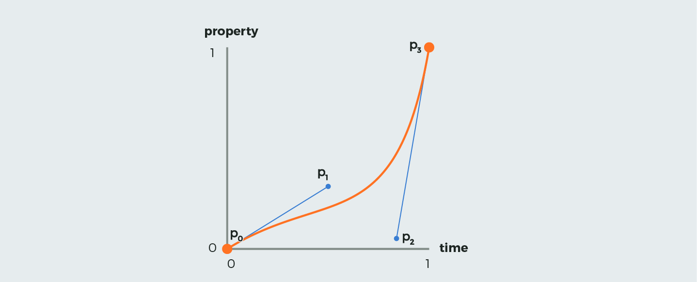
What do those values mean? First lets understand the structure and a cubic bezier curve.

A curve is defined by four points ...

Read more...

A Rainbow Thing

I came across this gif on reddit today.


No idea how it was made but thought it would be an interesting challenge to replicate it with css keyframe animation. I explicitly set out to do this with no javascript just to explore the limitations of keyframe animation, and yes, I am well aware that the problems listed below can all be solved with JS. Thats not the point.

Here are some interesting limitations of keyframe animation that I came across while doing this.

Problem 1: Iteration Delays

As helpful as the animation-delay property can be, it only delays the start of the animation relative to page load (or to when the animation was applied to the element). There is no delay-per-iteration type property. I would love to be able to specify an animation something like this…

...
Read more...