Cubic Bezier Curves
Preface
Everything I make is made to work in the latest chrome. Because this is a dev blog I don’t bother with vendor prefixes / browser compatibility.
Curves
A cubic bezier curve in CSS looks like a bunch of random numbers.
.class {
 transition: all 1s cubic-bezier(0.95, 0.05, 0.795, 0.035);
}
What do those values mean? First lets understand the structure and a cubic bezier curve.
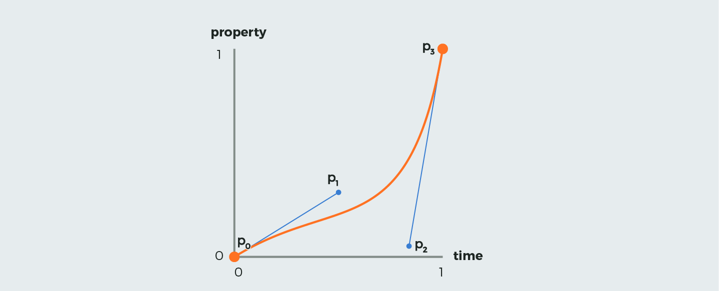
A curve is defined by four points. In the above diagram, P0 through P3. However, P0 and P3 always have the coordinates (0,0) and (1,1) respectively, so we only need to define the coordinates of P1 and P2. The four values define the X and Y coordinates of those two points, like so:
.class {
  transition: all 1s cubic-bezier(P1x, P1y, P2x, P2y);
}
You can play around with a bezier curve generator tool like cubic-bezier.com if you are curious how the coordinates of these points effect the curve. Disclaimer: I have never made a cubic bezier ‘by hand’ because there are so many awesome resources like easings.net from which you can copy paste.
The Fun Part (making pretty things)
Two opposite curves
The two curves I am going to use below are these, taken from easings.net

easeInExpo is called $delayed in the code as it starts out basically doing nothing and then quickly goes to 100%. easeOutExpo is called $immediate as it goes to 100% very quickly and then levels off. Note: I hate naming variables.
Transitioning multiple properties
There are a surprising number of stack overflow questions where people don’t know you can define different transitions for different properties, like so:
.class {
  transition: font-size 1s $immediate, transform 1s $delayed;
}
Going further, what if you want to transition font-size with $immediate, transform with $delayed, and opacity with $immediate? That line starts to get long really fast. A neat trick is to transition all with the most common easing and then any ones following all are effectively overridden.
.class {
  transition: all 1s $immediate, transform 1s $delayed;
}
Putting it all together
Consider the case of creating a sort of two-stage effect on a div. First make it wider, then make it taller. A lot of time people use Javascript to first apply a class to transition the width, and then half a second later another class to transition the height. But why use JS for something so simple? The pure CSS solution is to transition two ‘opposite’ bezier curve easings on two separate properties (width and height) like the example above, and you can get a great two-stage effect.
The Result
See the Pen cubic bezier animation by Skylar Brown (@skylarmb) on CodePen.